
How to Choose a Personal Color Palette that You Love
Do you ever feel like your wardrobe just doesn’t work for you? Maybe the colors feel all over the place…or your outfits just don’t reflect who you are anymore. If that sounds familiar, you’re in the right spot.
Today, we’re talking about how to build a personal color palette that not only flatters your skin tone but also reflects your unique style and personality. By the end of this post, you’ll have all the tools you need to create a wardrobe that feels cohesive, confident, and totally you.
And don’t worry—I have a special surprise for you at the end to make the whole process even easier.
Let’s dive in.
Step 1: Understand What Flatters Your Skin Tone
The foundation of any personal color palette starts with understanding what actually looks good on you. And the easiest place to begin? Your skin tone.
Now, you’ve probably heard all sorts of tips—like checking your veins or holding up silver and gold jewelry. While those can be helpful, I like to keep it simple and practical.
Here’s what to look for:
1. How does your skin react to the sun?
If you burn easily and don’t tan much, you likely have a cool undertone.
If you tan easily and rarely burn, you’re probably warm-toned.
If you burn slightly but then tan, or if it’s hard to tell either way, you may be neutral.
2. Look at the veins on your wrist:
If they look blue or purple, that’s a sign of a cool undertone.
If they appear greenish, you’re likely warm.
If it’s tough to tell or you see a mix of both, you might be neutral.
3. Try the jewelry test:
If silver jewelry makes your skin glow, you’re probably cool-toned.
If gold flatters you more, you’re likely warm.
If both look equally good, you’re probably neutral.
Once you have a general idea, hold a few different colors up near your face. The right shades will make your skin look brighter, your eyes pop, and give you that healthy glow. The wrong ones? They can make you look a little tired, washed out, or even a bit sallow.
And don’t forget—your past outfits are full of clues. Think about the colors you’ve worn that always seem to get compliments. That’s usually a sign that color works beautifully with your natural tones.

Here’s a quick cheat sheet once you know your undertone:
Warm undertones: Earthy shades like gold, olive, camel, coral, and warm beige are your go-to.
Cool undertones: Jewel tones like sapphire, emerald, ruby, and cool grays will make your skin sing.
Neutral undertones: You can wear both warm and cool colors—think soft taupe, blush pink, jade, and classic navy.
Step 2: Factor in Your Eyes, Hair, and Contrast
Now that you’ve got a sense of your undertone let’s layer in another key element: your natural coloring, which means your eye color, hair color, and the overall level of contrast in your features. This is what brings dimension and personality into your color palette.
Your natural features can give you a big clue about how much contrast you can carry in your outfits and how bold or soft your colors should be.

Here’s what to look at:
1. Dark Hair + Dark Eyes = High Impact
If you have deep, dark hair (think espresso brown or black) paired with dark eyes, you have a naturally rich, dramatic look. Your features are already bold, so your wardrobe can reflect that!
You’ll look stunning in saturated, intense colors—think emerald green, cobalt blue, deep burgundy, or vibrant magenta. These richer hues will hold their own next to your striking features without overwhelming you.
2. Light Hair + Light Eyes = Soft and Subtle
If you’re blonde or light brown-haired with blue, gray, or green eyes, chances are your features are more delicate and subtle. Soft, dusty tones will feel most harmonious with your natural coloring.
Colors like soft peach, dusty rose, sage green, powder blue, or lavender will enhance your features without overpowering them. Think gentle and graceful—colors that echo the softness in your hair and eyes.
3. High Contrast Features = Bold Possibilities
If you have a strong contrast between your hair, eyes, and skin tone—like fair skin and dark hair or deep skin and light eyes—you can really play with contrast in your wardrobe.
Bold color combinations like black and white, navy and bright red, or teal and coral will echo that contrast and create a striking, pulled-together look. This is where you can really lean into graphic, high-contrast pairings.
4. Low Contrast Features = Tonal Harmony
On the flip side, if your features have less contrast—say, medium-toned skin with medium brown hair and hazel eyes—you’ll look best in more tonal, blended color palettes. Outfits with smooth transitions between shades—like olive with khaki, or taupe with ivory—will enhance your natural harmony.
Quick Tip: One easy way to check your natural contrast level is to take a photo of yourself in natural light and switch it to black and white. If your hair, eyes, and skin tone look very different in grayscale, you’ve got high contrast. If everything blends together, you’re lower contrast.
Why This Matters
Understanding your natural coloring helps you choose not just what colors to wear—but how to wear them. You might love a bold fuchsia, but depending on your contrast level, you might wear it as a blouse or keep it as a handbag or pair of shoes.
The key is balance. Once you learn to work with your natural features, everything just starts to click. Outfits feel easier to put together, and you’ll notice how your clothing complements you, not the other way around.
Step 3: Add Your Personal Favorites
Okay, now we’ve covered the colors that technically flatter you based on skin tone and natural coloring—but here’s the truth: the colors you love are just as important.
This is your wardrobe, and it should reflect your personal taste, not just what a color analysis chart says is “right” for you. So if there’s a color that lights you up inside—even if it’s not the most flattering shade near your face—don’t toss it aside. We’re going to find a way to make it work!
Love Bright Colors? Don’t Hold Back.
If you’re someone who loves bold, vibrant hues—hot pinks, bright corals, lemon yellows—but you’ve been told they’re “too much” or don’t suit your undertone, guess what? You can absolutely wear them.
The trick is in how you wear them.
Here are a few of my favorite styling tips:
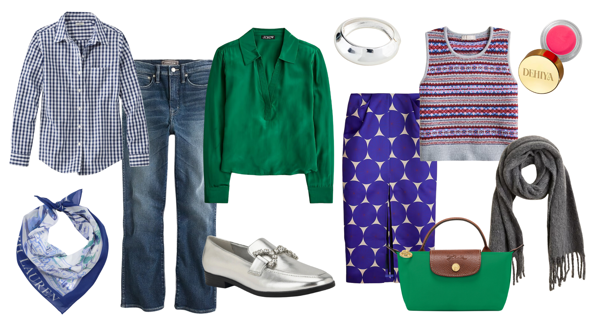
Use bold colors as accents—a statement handbag, a pair of fun shoes, a printed scarf, or even a bold necklace. These pops of color still show off your style without overwhelming your complexion.
Wear the color away from your face—opt for colorful pants, skirts, belts, or shoes instead of tops or jackets. That way, the color doesn’t compete with your natural glow.
Layer smarter—if you’re dying to wear a color near your face that doesn’t quite flatter your skin tone, just layer it. Throw a crisp white blouse underneath, add a scarf that brings the right color near your face, or mix in a statement necklace in a flattering shade. Problem solved!
I do this all the time. I personally love creamy neutrals like wheat, beige, and tan—but they’re not the best colors for my skin tone. So, I get creative. If I wear a wheat-colored sweater, I’ll pop a white button-down underneath so the white brightens up my face. Or I’ll pair the sweater with pants in that color and keep my top in a shade that lights me up. Little tweaks make all the difference.
Wear What Makes You Feel Like You
Beyond what flatters you or fits a color wheel, your color palette should make you feel good. If you feel amazing in lavender or mustard yellow, then those belong in your wardrobe. Confidence trumps color theory every time.
And don’t forget—this is where your personality shines. Bold colors often reflect a fun, energetic spirit. Soft tones may speak to your love of calm, cozy spaces. There’s no right or wrong here. It’s about leaning into what feels authentic to you.
Because when you love what you’re wearing, you look better—no matter what the “rules” say.
Step 4: What Do Your Colors Say About You?
Let’s get a little personal here—because your favorite colors aren’t just about fashion… they actually tell a story about you.
Your color choices say a lot about your personality, your mood, and even how you want to show up in the world. This is where your wardrobe becomes more than just clothes—it becomes a reflection of who you are and how you want to feel every day.
So, let’s break it down a bit.
Are You All About Bold, Vibrant Shades?
If you’re naturally drawn to bright, high-energy colors—think electric blue, hot pink, vibrant red, or sunshine yellow—there’s a good chance you have a playful, outgoing, or even adventurous side to your personality. These colors tend to reflect a zest for life and a desire to make a statement. You might love standing out in a crowd or just enjoy having fun with fashion.
Even if your wardrobe leans more classic, those pops of bold color—maybe in your earrings, shoes, or lipstick—could be your way of expressing that fun, creative spark.
Or Do You Prefer Soft, Muted Tones?
On the other hand, if you’re more drawn to colors like dusty rose, sage green, chambray blue, or soft taupe, that often points to a more calming, grounded, and understated energy. You might be someone who loves cozy environments, quiet elegance, and timeless simplicity.
Muted colors are a beautiful way to communicate warmth and approachability. They’re relaxed but refined—and they make it easy to mix and match without feeling overdone.
What About Neutrals?
If your wardrobe is full of neutral shades—cream, navy, camel, gray, white—it might mean you value versatility, simplicity, or a polished, minimal look. Neutrals can also serve as a canvas to showcase your accessories, your silhouette, or your textures (think cozy knits or crisp tailoring).
And sometimes, we reach for neutrals during different seasons of life. If you’re simplifying, shifting your style, or just want a calmer approach to getting dressed, a soft, neutral palette might feel like a fresh start.
Style is Personal—And So Is Color
There’s no right or wrong here. Some days, you might crave high-energy hues and other times, you might want to wrap yourself in cozy, comforting tones. Your personal color palette should reflect all of those beautiful, layered parts of you.
The real goal? To wear colors that feel like you. Not just what flatters your skin tone. Not just what’s trendy. But what makes you feel confident, comfortable, and totally at home in your own style.
So ask yourself: What colors make me feel the most like myself? That’s where the magic begins.
Step 5: Audit Your Closet for Clues
Before you buy anything new or overhaul your entire wardrobe, I want you to start with what you already own—and, more importantly, what you already love.
Seriously—there's no need to toss everything or start from scratch. The best personal color palettes usually begin in your own closet.
Start with Your Favorites
Take a look at the pieces you reach for the most. The ones that make you feel amazing, the ones you get compliments on, or even just the ones that never seem to end up back on the hanger because you’re always wearing them.
Lay them out on your bed and take a step back. Do you notice any color themes? Maybe you’re naturally drawn to navy, blush, or olive—even if you didn’t realize it. That’s your closet giving you a big clue. These are likely your base colors—the ones that form the core of your wardrobe and help everything feel pulled together.
Identify Your Neutrals
Next, let’s look for your neutrals. These are your wardrobe workhorses—the pieces that ground your outfits and help your accent colors shine. If you’ve followed me for a while, you know I’m always talking about the power of great basics. Well, color basics are just as important.
Here’s a little guide:
Warm undertones: Try warm neutrals like beige, camel, tan, or chocolate brown.
Cool undertones: Go for navy, charcoal gray, soft white, or black.
Neutral undertones: You can mix and match—taupe, dove gray, or even cream work beautifully.
These neutrals will be the colors you build around—think trousers, jackets, everyday tops, and outerwear.
Add Your Accent Colors
Now comes the personality! Choose 3 or 4 accent colors that make your wardrobe pop and feel like you. These are the shades that bring joy, energy, or softness into your style—depending on your vibe.
A few examples:
If your neutrals are navy and white:
Try accent colors like coral, turquoise, mustard, or even bright red.
If your neutrals are cream and taupe:
Go for softer accents like blush, sage, sky blue, or lavender.
Accent colors can show up in tops, scarves, statement jewelry, handbags, or even shoes. These are the pieces that make your wardrobe feel fun, fresh, and uniquely yours.

Step 6: Use a Color Wheel for Outfit Harmony
Now, if you’ve ever stood in front of your closet and thought, “Do these colors even go together?”—you’re not alone. That’s exactly why I love using a color wheel.
It’s a simple, inexpensive tool that helps you understand how different colors interact—and it makes outfit planning so much easier. (I’ll link one in the description if you need one for your styling toolkit.)
Here’s how it works:
Analogous colors are the ones that sit next to each other on the color wheel. Think blue, blue-green, and green. These create soft, harmonious looks because the colors blend seamlessly. If you love a more subtle, polished style, this is a great option.
Complementary colors are opposite each other on the wheel—like blue and orange, or red and green. These pairings create bold contrast and energy. They’re a little more daring but can make for a standout outfit when done right.
For example:
Pairing a coral blouse with teal accessories
Wearing a lilac top with mustard yellow shoes
Mixing sage green with soft peach tones
Once you start playing around with these pairings, you’ll notice how much easier it is to mix and match pieces without your outfits feeling disjointed.
Pro Tip: Keep your neutrals in mind when you’re working with the color wheel. Neutrals act like the “glue” that ties your accent colors together, helping everything feel more cohesive—even when you’re playing with brights or contrast.

Step 7: Style Meets Practicality
Let’s pause for a second and bring this back to real life—because here’s the thing: your color palette shouldn’t just look pretty—it needs to work for your everyday lifestyle.
It’s easy to get swept up in color charts or Pinterest-perfect palettes, but if the colors don’t actually make sense for how you live, it’s just not going to stick. And that’s where practicality comes in.
Anchor Your Palette in a Way That Makes Sense for You
If you love bright colors, please don’t feel like you’re stuck with black and beige just to “tone things down.” You can absolutely embrace color—you just need a few solid base colors to help balance everything out.
Let me give you a real-life example: One of my favorite wardrobe projects was building a capsule using all Lilly Pulitzer brights—we’re talking hot pinks, lime greens, and wild prints. But the magic came from grounding everything with core basics like white, navy, and gold. That gave me the freedom to play with all those fun colors without my outfits feeling chaotic.
Neutrals Don’t Have to Be Boring
And if you’re someone who feels most at home in neutrals? That’s wonderful, too! Don’t let anyone tell you beige is boring. You can wear all beige, all gray, or all cream—just have fun mixing up the textures and tones.
For example, a camel coat over a chunky cream sweater with tailored oat-colored pants… dreamy! Add suede boots or a silk scarf, and suddenly a neutral outfit feels incredibly chic and elevated.
Think About Your Lifestyle
Are you someone who needs pieces that go from casual days at home to an evening dinner? Do you want a wardrobe that’s easy to pack for a quick getaway? Or maybe you just want to get dressed in 10 minutes and still feel pulled together.
Your color palette should support that. If your life is more relaxed, stick to a few key colors that mix and match easily. If you love dressing up and playing with prints, leave room in your palette for those bolder moments. It’s all about balance.
At the end of the day, your wardrobe should reflect your life—not complicate it.
Step 8: Test and Tweak (Don’t Stress!)
This last step is one of the most important—and also the most freeing.
Please don’t feel like you need to figure out your perfect color palette overnight. This isn’t a test you have to pass. It’s a process—and it’s allowed to evolve as you do.
Start Small
Instead of investing in a whole new wardrobe, start by playing with accessories. Grab a scarf in one of your new accent colors. Try a pair of earrings or a fun handbag. See how the color feels when you wear it. Do you feel more confident? Do you find yourself reaching for it again?
If it works—great! If not? No big deal. You haven’t invested a ton, and you can easily adjust.
Let It Evolve with the Seasons (and Your Mood)
Your personal color palette can shift with the seasons of the year—or even the seasons of your life. You might love adding red for Valentine’s Day, patriotic tones in summer, or rich autumnal shades in the fall. Festive greens or cozy cranberry hues might sneak into your winter wardrobe.
That’s the beauty of color. It doesn’t have to be rigid. Your wardrobe can grow, change, and adapt as you do.
And remember—this isn’t about following rules. It’s about creating a color story that makes getting dressed easier, more joyful, and completely you.
Ready to Build Your Perfect Palette?
Now that you know how to create your personal color palette, it’s time to take action and make it your own!
To help you get started, I created the Perfect Palette Color Workbook—a step-by-step guide to walk you through the process in a fun, easy way. It’s totally free, and it’ll help you map out your core, neutral, and accent colors so your wardrobe feels like you from top to bottom.
👉 Click here to download your free copy
So… what colors are you loving right now? Let me know in the comments—I always love hearing what inspires you. And if you’re ready for the next step, head over to my YouTube channel, where I break down how to build a colorful capsule wardrobe with Lily Pulitzer brights (yes, even if you’re over 50—it totally works!).


